Drafting Compass
-
-
Hi Earthmover,
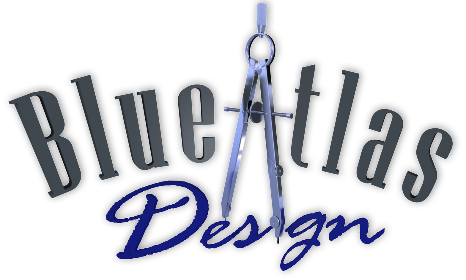
really love the compass, especially the render.
In the logo the compass is seen exactly from the front, i think it might even be more beautiful if it was seen from a little bit to the left or the right where you would see the scrollwheel (don't know the correct word for it) some more. (like in the render)And somehow the letters of 'design group' seem to be a little strange compared to the letters of 'Blue Atlas'. (like two different views mixed?), maybe also because the letter 'D' seems to be closer to the drawing than the rest of 'Design'?
(But nevertheless, the compass itself is something i am not capable of making myself yet so...) -
Thanks Fred, I will try and angle the compass a little more. Thanks for liking my compass model also. Here is the model if you would like to examine closer how I made it.
-
Nice and original logo!
-
Adam,
The compass is wonderful. I am curious why the edges appear to have so many polygons. Can't that be done with a simple radius with long sides? Just a modelling question.
Peter
P.S. I haven't forgotten about the CAD files, just need to find the time to sort and send.
-
Thanks Tom!
Decided to try again. This time I took the compass into 3ds Max and did all the layout and font's in there. I used slight beveling and added a bend modifier to the upper letters. Rendered in Vray for Max.

-
Peter, the extra polygons on the edges are the result of using Fredo's round edges by bezier plugin. I first extrude a 2D shape and double click on the front face to select the edges, then I run the script. I'll have to do about 5 minutes of corrections, but the results are very clean and accurate. I only round the edges that are going to be seen in the render, and it's just to pick up a slight amount of reflection and light bounce on the edge. After all there are not many true hard edges in real life.
-
Hey Adam,
Those look good but to me they don't represent a landscape design company as much as it could. What if, instead of a compass you used a sundial. It is still a compass so to speak but is also associated with a garden usually. I just typed sundial in Google images. The dial part of it could be the "A" in atlas and you could really play around with shadows,seeing as that's how they work. Just a thought. Either way I'm sure your design will look great.
Jeff
-
Thanks for the idea Jeff. The more I thought about it, the more I felt I needed to keep the logo pretty broad. We are doing a lot of general graphic design and visualization work, and although we are catering mostly to the landscape industry, I don't want the logo to limit our future marketing base to that field alone. I currently have a landscape design and build company that I have been funneling all my design work through. In the past 6 months I have done more and more work for other contractors and landscape architects. I'm hoping to continue growing that end of things, but I want to separate it from my installation company, so as not to create the wrong perception for potential clients. I also believe it's wise to diversify heading into a recession. I'm toying with the idea of broadening my design horizons past that of the landscape field.
-
I agree then. Going in a different or addition direction makes sense. So your focus is on "design" for the building/renovation industry then? I think with the recession starting, renovations will be more and new builds less. The BC, Canada, there is supposedly a tax incentive coming to renovate to kick start spending. Maybe your logo could have some sort of a transition in the design to represent the renovation aspect? Is your company name a definite choice?
Jeff -
No not a definite choice, but I'm 90% committed. It's named after my favorite tree, the Blue Atlas Cedar.

-
Hey Adam,
What about using your screen name from here? Earthmover Designs...?
Jeff
-
I actually kicked that around at first. Earth Mover....Earth Moving Design...something like that. I just didn't think it rolled off the tongue quite right.
I went ahead and purchased blueatlasdesign.com just in case.
Jeff, how is your design business endeavor coming along?
-
Yes...true about the name. My biz journey is getting there slowly. I just bought VRay and now need the time and some small projects to learn the program. I currently run a mill work shop for a custom trade show graphics and exhibit company. Eventually I'd like to get to the point where I'm doing prototyping and fabricating for product design and custom furniture. I will be buying Modo next month and continue adding to my programs. Any advise you can offer would be appreciated. Thanks Adam.
Jeff
Hello! It looks like you're interested in this conversation, but you don't have an account yet.
Getting fed up of having to scroll through the same posts each visit? When you register for an account, you'll always come back to exactly where you were before, and choose to be notified of new replies (either via email, or push notification). You'll also be able to save bookmarks and upvote posts to show your appreciation to other community members.
With your input, this post could be even better 💗
Register LoginAdvertisement


