New conference room render
-
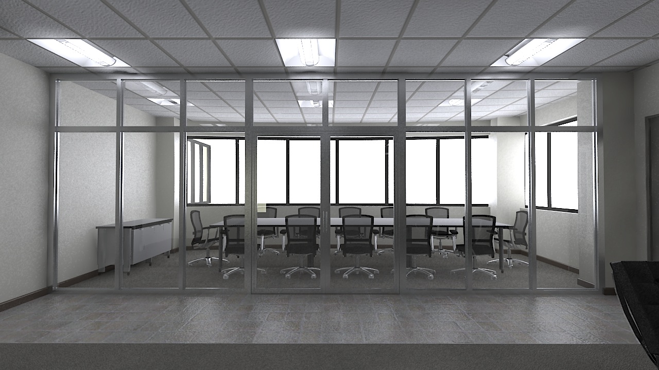
This is a proposal for a client. This area currently is wide open and is connected to the lobby. The client liked the idea of a glass wall, although they will need some sort of blinds.
Comments welcome. I know it is a bit dark (another render cooking now).
Scott
-
Scott
the rendering looks good, the two things that is right off are. the windows on the outside on the left side of rendering are floating and on the right side the wall between the windows the wall is bad washed out
but looks goodmike d
-
I agree on both points. The wall on the left needed to be seen by the client (at their request, I dont much like it either) and the wall on the right is washed out by a poor attempt by me to brighten the image
 Next render should be better.
Scott
-
Very nice Scott.
I would like to see something outside, even if it is a hint of something. Also, the chairs don't have any shadows under them that I can see, if so it is very light. The chairs almost look like they are floating.
I look forward to the next one.
-
I like it lots, I however would put a light behind the camera so that the glass between the lobby and conference room gets a slight reflection, that would give a mid ground to composition.
just an idea.
-
Scott,
Just trying to be helpful on general appearances. Nice all around modeling and light. (I like the realistic luminaire and furniture fixtures). A couple of things. The image looks cold, if that matters to you. It seems that meetings would be uncomfortable there. Is that window floating outside a part of the building outside? Not clear. The white glare from the windows seems not to be proportionate to the darkness inside. Maybe some content outside would make it seem less glaring and make the inside tones seem more balanced.
Peter
-
Thanks for all the comments.
Some light on the client might help. They are the financial end of one of the big 3 (maybe that is why it looks cold). I have been asked to add some images on the wall over the credenza of their new concept car (but was also told not to show anyone the images themselves, yet the friggin car is on display at the auto show...go figure). I added a plant in the corner for some color. The problem with working for an interior design firm (mostly office spaces) is that the clients always start out wanting color and a bright space and it ends up being a drab grey of shades of tan instead. Drives me crazy! I am rendering another version now, hopefully it will be done before I leave for the day.
Scott
-
Looks great, Scott. I noticed the line between the two doors disappeared, as usually happens in rendering programs when it's just a 3D line. If I am going to render the model, I always make an imperceptable gap or groove, or prop one door open.
Your lights look great.
Hello! It looks like you're interested in this conversation, but you don't have an account yet.
Getting fed up of having to scroll through the same posts each visit? When you register for an account, you'll always come back to exactly where you were before, and choose to be notified of new replies (either via email, or push notification). You'll also be able to save bookmarks and upvote posts to show your appreciation to other community members.
With your input, this post could be even better 💗
Register Login


Advertisement