Interior VRAY render (first)
-
Nice render but I agree with Eric. There needs to be something outside the windows. I helps to ground the render and give it depth. Not having anything outside the windows makes it a somewhat incomplete render.
-
thnx for you input guys
ant I'll try adding something outside (I have an Idea of what i'm going to do)
and I'll post the result when I'm finished with it
-
Great for first render.
Couple of suggestions:- TV screen would give me neck ache at that hieght
- I see that you have some sunlight in the corner of the room. I think the scene would be improved if the sunlight penetrated the room more (adjust the sun orientation)
Regards
David
-
I changed a couple of things in the model
the rendering i will accept came out a bit dark, but i like the feel of it,
I will be adding a couple more lights in the room,
because right now i only have the spotlights that light the picture frames.please do let me know what you think so i can keep on making this better
the quality of this images is not so good because my PC crashed last night and i didn't save the better one,
I am rendering it again so i'll upload it when it's done

(I changed the position of the TV and rearanged the pictures on the wall,
plus changed the glass material to a more blurred one, and adden a slight terrain outside)also on a side note, what do you guys think of my logo??

-
The last rendering you did does have a nice feel however the background behind the glass almost makes it look as if a tsunami is about to slam the house... just looks weird. Maybe just use a clear glass material with an HDR background...
-
Great description Bubba!

These are better and actually have more "feel" to them but I noticed the pictures leaning on the wall are actually not touching the wall. The floor also lacks some definition.
Scott
-
@unknownuser said:
These are better and actually have more "feel" to them but I noticed the pictures leaning on the wall are actually not touching the wall. The floor also lacks some definition.
Scott
Scott the frames are actually not touching the wall because they have stands behind them

and about the floor what do you mean by "definition", could you explaine this to me, and maybe even give me a few pointer on how to do "it"
and about the windows, i really don't want the outside to be visible,
would it be better if I reduced the blurred effect a bit??? -
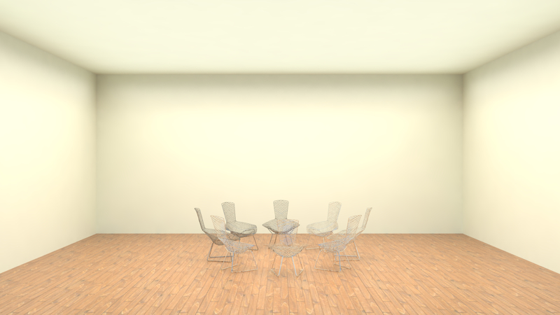
How do the pictures on the wall have a stand like that? Wouldn't they have to be sitting on some kind of shelf? I think what he meant by 'definition' is that the floor is just plain... as you can no longer see the seams between planks... maybe increase the bump a little... at least that's what I think he meant...
-

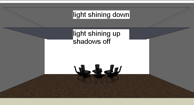
ok here's another go at it, hope you guys like this one. -
Yes Bubba that exactly what I meant
This last one seems darker than the others to me. There is an odd thing going on around the top edge of the room. Almost like a light source ir something. Just looks a bit out of place.
I would say work on lighting the room brighter. What you can do is set up to area lights, both with "ignore normals" OFF. Both should be about 24-30" from the edge of the ceiling. Place one just below the track lighting shining down with shadows on. Place the other 1" below that shining up with shadows OFF. both are to be placed "Invisible" these can be carefully tweaked as to not over power or take away from the affect of the track lights. This will give you more control over the lighting in the room.
Scott
Hello! It looks like you're interested in this conversation, but you don't have an account yet.
Getting fed up of having to scroll through the same posts each visit? When you register for an account, you'll always come back to exactly where you were before, and choose to be notified of new replies (either via email, or push notification). You'll also be able to save bookmarks and upvote posts to show your appreciation to other community members.
With your input, this post could be even better 💗
Register Login


Advertisement