Building Designs
-
Jay I just registered here. Cool place

I registered here to get some critic of my building designs. I think they are good, but... ask from the public.
Okay here they are -
Its one of my best. Ready for critic.
-
Jay
-
Jay. Big project
-
Are you looking for critique on the designs themselves or on the modeling (or both)?
It would also help to know, in either case, the purpose (either what the images are being used for / shown to or what the purpose of the buildings are)
-Brodie
-
Mmm... I think on both.

The buildings are my personal designs. I wanted people to see what I can do and what I can't.

And hey.
 I know that the modeling to the mall is poor, so don't critisice that.
  The cool curve design is the thing
-
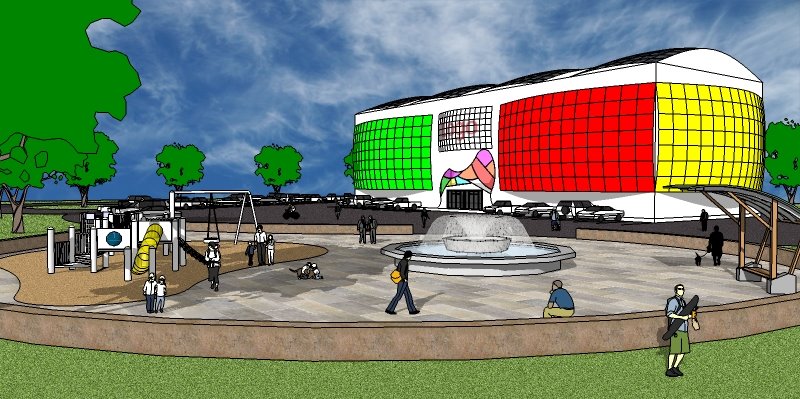
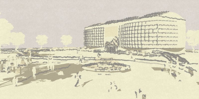
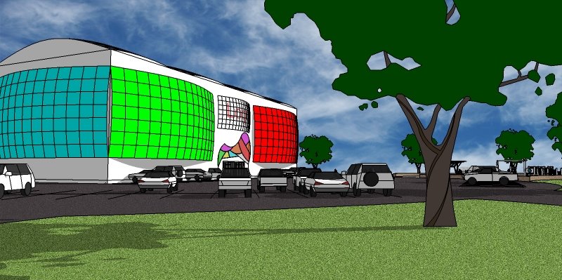
Shopping Mall:
It may very well be an interesting design. I do like the curve a lot. But the next step would certainly be to add some more detail. Right now it just doesn't read very well. I'm not sure the curve works or if that's glass (the colors are pretty vibrant) or what exactly is going on in general w/ the building. Hope that isn't criticizing the model itself too much but it's hard to separate the two too much if you know what I mean.
Of the 3 images I think the 2nd one is the best because it feels less like a straight sketchup output. I'd keep the monotone but I'd sharpen it up though so it reads better. In general all of your lines tend to look quite thick which adds to the cartoony look which I think detracts from your designs a lot.
Since you specifically mentioned the design aspect of it, as I already mentioned the curves are interesting. The main critique then, i'd have is that they're just sort of applied onto a boxy warehouse sort of building. I'd find a way to integrate and unify the whole design a bit more.
-Brodie
-
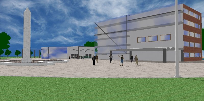
Future School:
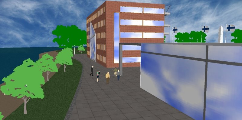
Again, detail will add a lot. Right now I see mainly a brick wall w/ punched windows. That might be what it is but what it's missing are things like window frames, mullions, cornice, base, etc. The details will not only add to the realism but it's also where design meets real life. The top of a building is going to have to end somehow. You can just cap it off w/ some metal flashing or you can add some stone or patterns, etc. but there will be something up there. And brick buildings often don't just meet the ground and stop. Often you'll see some limestone or something that handles the ground better than brick as that will be where all the water is pooling up, guys are running into your building w/ lawn mowers, bushes are growing, etc.
The 3rd image is probably the best. The first sort of looks like a section but not really. Unsure of what's going on there. The 2nd really shows off the big glass box w/ no detail which detracts. Most detracting in the 3rd is the big glass building in the back w/ no mullions. It should have some mullions and transparency to the glass to give it some depth. Right now it looks more like clouds painted onto a building than reflections. The transparency will help that even if it's not enough to really see that it's a hollow building.
-Brodie
-
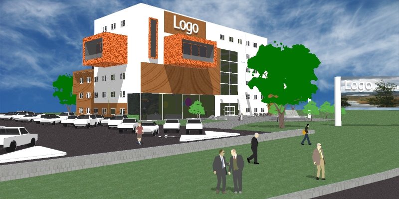
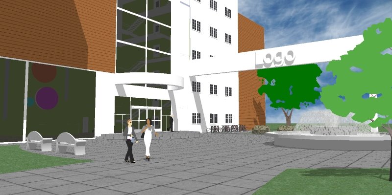
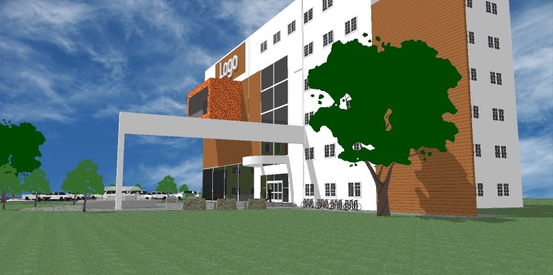
Business Building:
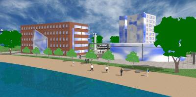
I think this is your best one of the 3 both modeling and design wise. It seems to be the most developed in both areas. The main critique I'd say design wise is that those projecting elements seem pretty far out there. They might be possible in the sense that just about anything is "possible" but they aren't that likely. From inside the building you could get the same effect w/ 2' rather than 12'. From outside they're cool but not terribly integrated. To sell something like that they'd have to really be essential for the whole design. For example they'd make more sense if the opposite were present, that is deep rectangular cut outs in the building which could serve as patios or some such thing. Also if the tops of the projecting elements were usable or some sort of green space that would provide a nicer view for the upper floors they'd make more sense.
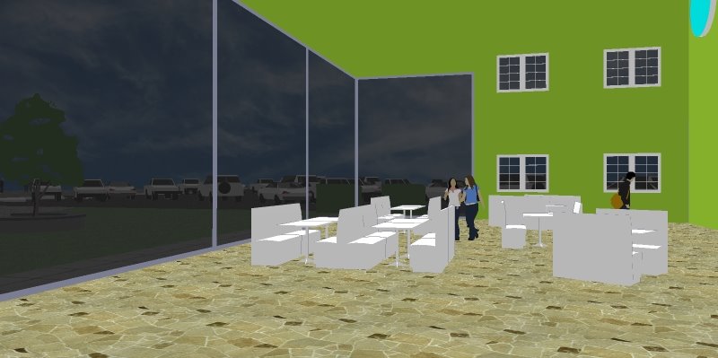
In the final image you did a good job w/ the glass and 'reflection' but you should throw some shadows in there as the back wall doesn't read very well.
hope these critiques help. Please keep posting as these or other images develop!
-Brodie
-
Yes. Thanks for your critics. I've been thinking too about some of the things you brought up. The Business Building is my best, indeed and I wanted people like you to say what they like about it
 . The future school, I think, is too a good model. I didn't make any interior to it, so I tried to hide the inside of the building with the cloud pattern. I thaught it was good but now when you said that it doesen't give the depht feel to it, I saw where I was wrong. Thank you for the critic where I can improve my modeling
  .
.If anyone has any ideas to hide the missing interior, or to make a fast, yet good looking interior, I'd like them here. You could also say your own technicues of making interior look good for exterior buildings

Hope it makes sense

-
Regarding the cloud issue, I wouldn't model the interior. I think the texture is ok. What I think needs to be done is simply to break up that exterior a bit. Right now, relative to the scale of the people the glass panels on that building look really really big. So my assumption is that there should be some more mullions in there (maybe smaller than the main ones you showed). So I'd put those in to break up that facade. I think that would help a lot.
I'm not sure if it'd work for the view you have but sometimes if you do a real light transparency you can get away w/ showing some more depth w/o being able to see enough detail to know that what you're seeing is just the inside of a box rather than a modeled interior. Your view is probably to close for that little trick but if it's at a distance this will sometimes work.
-Brodie
-
Thank. I try to improve.
Hello! It looks like you're interested in this conversation, but you don't have an account yet.
Getting fed up of having to scroll through the same posts each visit? When you register for an account, you'll always come back to exactly where you were before, and choose to be notified of new replies (either via email, or push notification). You'll also be able to save bookmarks and upvote posts to show your appreciation to other community members.
With your input, this post could be even better 💗
Register LoginAdvertisement


