Dwc render
-
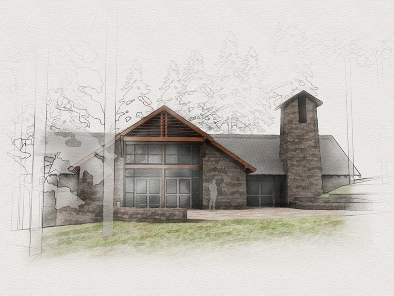
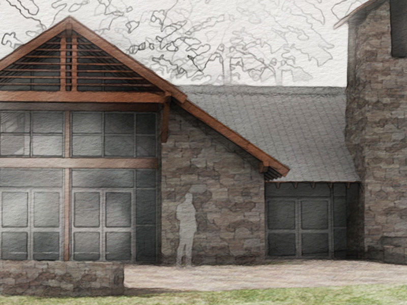
a render using parts the DWC technique of a chapel in the forest- I would like to do a few iterations to improve on it, so all comments on modeling/texturing/rendering/composition are more than welcome!
I am not necessarily going for the exact DWC look- this is trying to be more organic than hard/clean
thanks!
-
you are closer

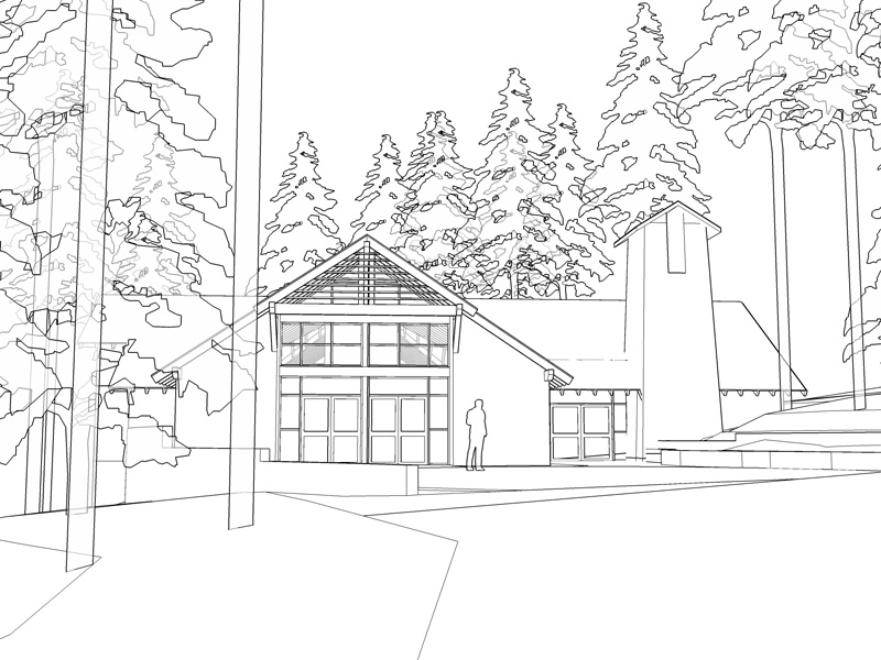
i think the drawing needs to be strength_en_d on the base line more just to look more organic
the paradoxe¡ -
this is pretty nice.. like the final output and the design as well..... that looks like a render as a base, not straight sketchup output? very nice though.. love the subtle background as well..
-
I have to agree, this is nice and the background is a great effect!
Scott
-
what do you say mirjman '?
-
Lovely image! The linework is so boldly stylistic yet integrates quite nicely into the softness of the image...I really get the feel of the forest! Do you think a bit more contrast, just a very few darker darks, might help?
-
Wonderfull image mirjman. I love the technique

-
Looks great. What textures did you use for the stone & grass?
-
hey guys- thanks for all the comments,
juan- can you explain what you mean about the base line, i am interested in your comment
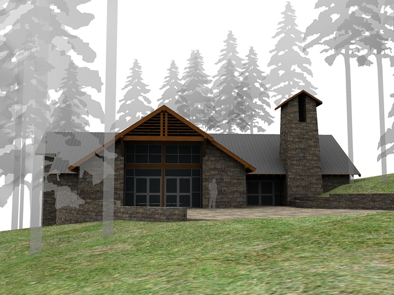
marked- right on, i started out with a very bad podium render.. set no lights or sun settings, but it gives a nice soft base
tom- great idea about the contrast, i was thinking the image was slightly "flat", I'll be working on another version with some more darkness/depth
drew- i picked up the grass texture somewhere on 3dwarehouse, the stone texture provided by an artificial stone manufacturer website, and I forget the name, i would upload them but the images are too large. Sorry it has been a long time since I added them to my library
-
Mirjman,
The first image is otherwise very good and communicates the mood very well, but I would get away with the "smudges" in front of the main entrance, IMO the fading effect should start from somewhere just to the right of the first tree, leaving the entrance area with its natural deepish shadows.
Thanks for giving the insight to your technique
Anssi
-
i mean something like this
do not have the brown colour of your roof beams, sorry
-
I really love this technique, great job!
Hello! It looks like you're interested in this conversation, but you don't have an account yet.
Getting fed up of having to scroll through the same posts each visit? When you register for an account, you'll always come back to exactly where you were before, and choose to be notified of new replies (either via email, or push notification). You'll also be able to save bookmarks and upvote posts to show your appreciation to other community members.
With your input, this post could be even better 💗
Register LoginAdvertisement


