The verdict is in...
-
I still think you need something in the big yellow expanse in the centre. There is too much of it for the eye to carry on and leap towards the next "thing".
At this size it looks a little "fuzzy/mushy" but maybe printed at full size it wouldn't be so. Also I only have one lens in my glasses so maybe that is affecting my vision.
-
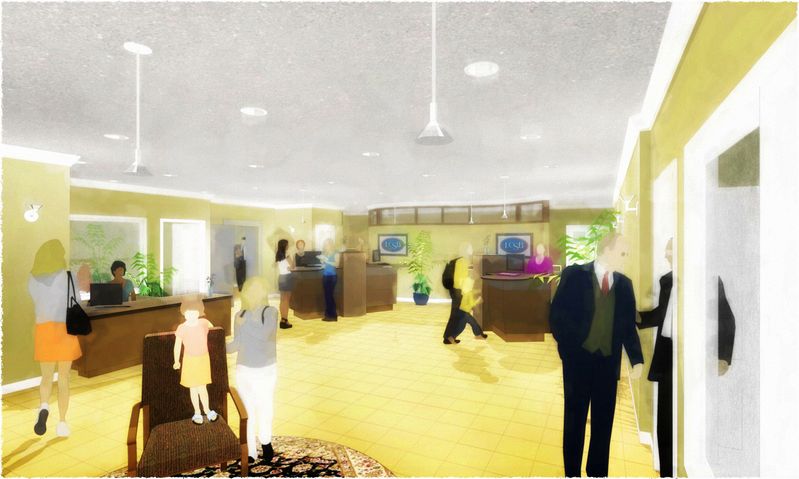
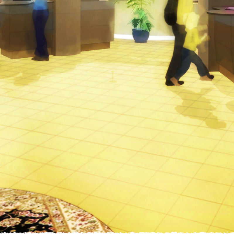
Susan...still may not carry for you, but I enhanced the image a bit to compensate for the small size (and left off the paper texture) then did some of the sheens and shadows brush work I was talking about to intensify the relationships between the hard points and lines around the open floor...which should (sometimes) lead your eye forground to background.
My lithos of so long ago (the inspiration for this style) were always more of a dance for the eye than a stroll...but obviously I haven't learned to make the CG instruments really sing...yet! :`)
-
I like them tom; although the mat on the floor is a little out of place in a NPR image I think....
I'd like to know how you are producing them.

-
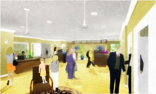
The Style is not the main issue for me. Tom. It is still the composition. I've attached a sample proposed adjustment. I'ms sure you can come up with something better and more in keeping with your style, but that huge space in the centre of the floor is killiing the composition. This might give you some food for thought.
But you may also want to give some thought as to what your subject is. Is it the space? If it is, then the space is not coming across as the most important item but the woman and child up front are. They are the centre of interest because they have the greatest degree of definition and contrast.
It may be more appropriate to make the desk area and person behind it more the centre of interest: After all that spells "BANK". You would need to change the sharpness and and increase the colour contrsst in that area then mute the people in the front. Put them in shadow, make the colours more muted and less differentiated. Certainly mute the carpet. On second thought get rid of the lady, armchair and kid altogether and use a rectangulr carpet pointing inward as a visual path ( on some nice diagonal)but make sure the pattern isn't too prominent,or maybe just use the shadows of some people we cannot see just outside the space, . You would need to juggle the midgroung people a little then perhaps. But still, I would make some "work area" within the space the centre of attention.
-
Of course you're right, Susan, the subject is the space...the use of it, that is, by the community with the new dialog banking towers (to be installed in front of the new curved wall in the back). With that in mind I switched the fuzzy from back to front, in to out, and think the sharpened focus on the other side of the expanse works much better on several levels. Thanks for that.
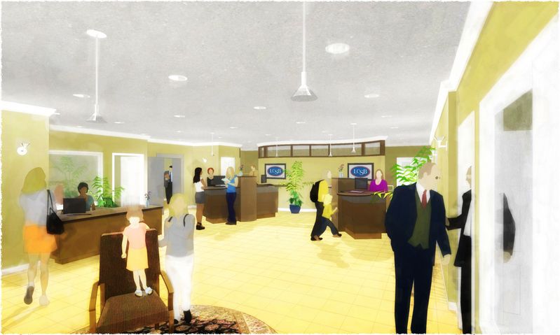
Also noticed finally there is a "circle the wagons" feel that needs to be relieved...I'll work on that (but now I just have to prove I can make that open area work: for me and you, wish me luck :`). And, thank God, I'll now let myself change that hideous existing yellow floor a bit, and loose the image textures altogether (the banker's wife isn't gonna see this anyway).Best, Tom.
-
This is becoming a great thread; I wish we could give it a star rating....[like PushPullBar]
Coen, is this possible? you know identify 5 Star threads....
-
Andrew, thanks (me too :`) and means a lot from you. Here's the short explaination, I'll provide more if you want:
I used LightUp exports similar to the ones shown in this thread http://www.sketchucation.com/forums/scf/viewtopic.php?f=81&t=11543 to create this image as a base layer:
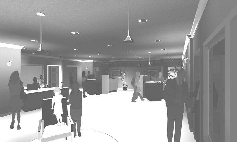
Over that is this transparent layer at about 20% normal to lay down something for the color to be added above it to react with:
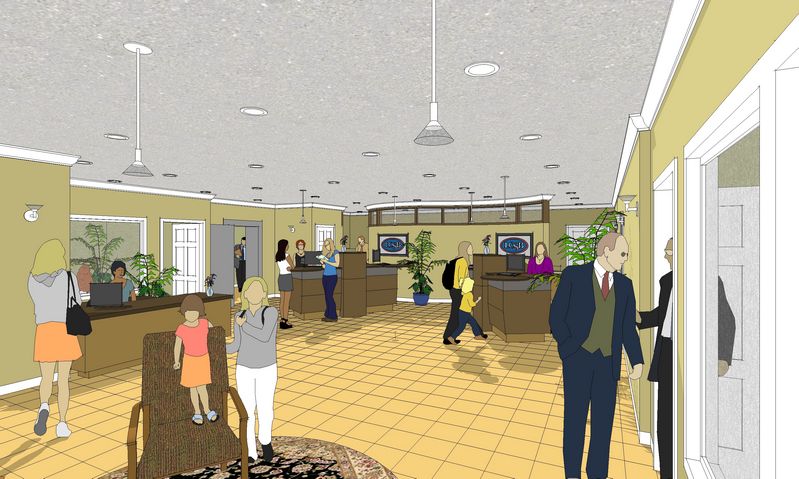
Then this blended image, from a straight SU export sans edges and the same hit with a SnapArt oil pastel filter, is used twice...first as a somewhat transparent soft light layer, then as full on hard light layer:
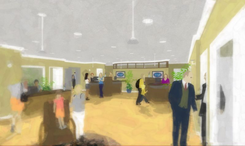
After that I save out the compiled jpeg and continue to process the little bothering bits (and will soon learn the wonders of brushwork :`) The result (sans brushwork) is above in response to Susan...whadaya think? Tricks or tips...suggestions? Anyone? -
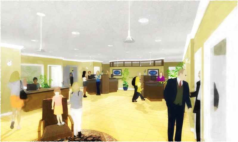
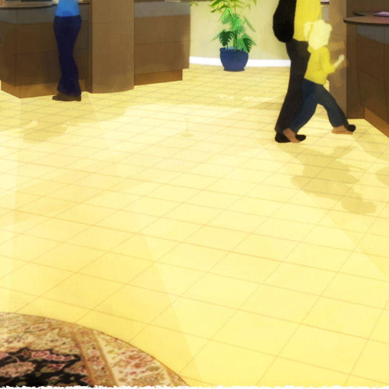
Well...here's the final of this stage of my development and this image: the "eye paths" are in across the expanse (love having a greyscale background to work with for that purpose...colors don't get screwed while fussing around) and I feel not the "circle the wagons" now, so I'm pleased. I have to go quit smoking...soon...today, so will get back to all this in a few. Meantime...
...any final comments, suggestions, etc. would continue to be greatly appreciated, thanks very much.
Best, Tom.
-
Thanks Tom for the short tut.

I will have to ry this some day. Well done!!
-
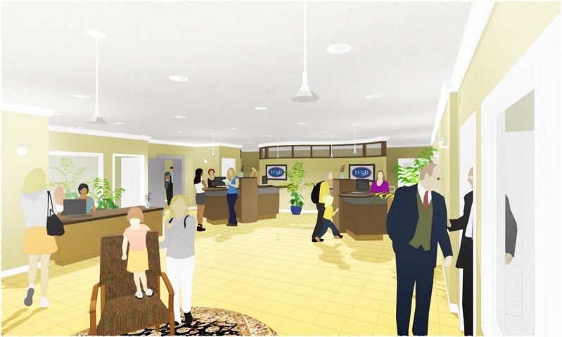
Thought I'd better do one sans pastel to prove I was listening (and to send the fellows who made the original verdict :`)
First three rules of architecture:
Get the work!
Get the work!
Get the work!Thanks again all!
-
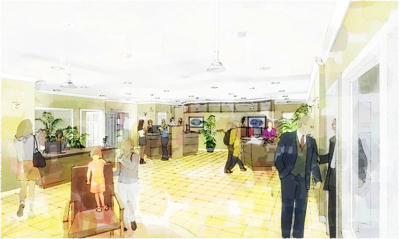
Had to check if this PSP build logic would work for a DWC...I think so ;~)
-
looks like you had fun... but for my clients, they just wouldn't "get it".
Hello! It looks like you're interested in this conversation, but you don't have an account yet.
Getting fed up of having to scroll through the same posts each visit? When you register for an account, you'll always come back to exactly where you were before, and choose to be notified of new replies (either via email, or push notification). You'll also be able to save bookmarks and upvote posts to show your appreciation to other community members.
With your input, this post could be even better 💗
Register LoginAdvertisement


