New work from new job
-
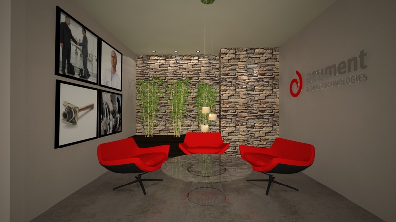
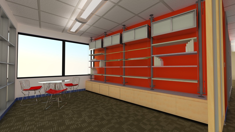
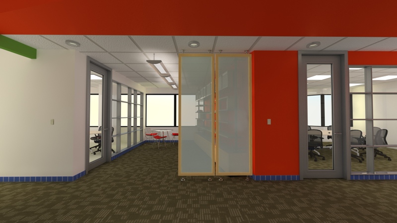
I have been extremely busy with my new job (full time modeler and renderer) but I wanted to post some stuff I have worked on lately. Both are modeled in SU and rendered in Vray. Both are not perfect by any means and are still WIP's but I wanted to get some comments.
Scott


-
your very interesting proposal
cheers,
Fernando -
Looking good Scott. I have a couple of comments.
On the first image there are light "flecks" in the sign. They are very distracting.
and on the second image, maybe some items on the shelves?I'm looking forward to seeing more progress

-
Congrats on your new job, Scott.
The first image looks odd - appears as if the glass table is leaning toward the viewer? It also appears as if the chairs are right up against the table.
Also, IMHO, the blue tile base clashes with the carpet.
Other than that, they look great. -
Good renders Scott.
They look a bit dark to me, but that could be caused by screen settings.
Good luck on your new job.

You'll do fine.regards,
Kwistenbiebel
Hello! It looks like you're interested in this conversation, but you don't have an account yet.
Getting fed up of having to scroll through the same posts each visit? When you register for an account, you'll always come back to exactly where you were before, and choose to be notified of new replies (either via email, or push notification). You'll also be able to save bookmarks and upvote posts to show your appreciation to other community members.
With your input, this post could be even better 💗
Register LoginAdvertisement


