Interior design competititon
-
hello at all!
finally i have done something i can show all! (usually i can't show my works with SU, strict rules from my boss and also from the freelance assignments).
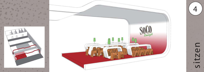
a couple of weeks ago i participated with a friend of mine in a interior design competition. we were to submit a design for a new bar concept for SoCo (maybe bettern known as southern comfort - please do not comment about the beverage
 )
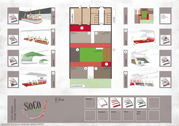
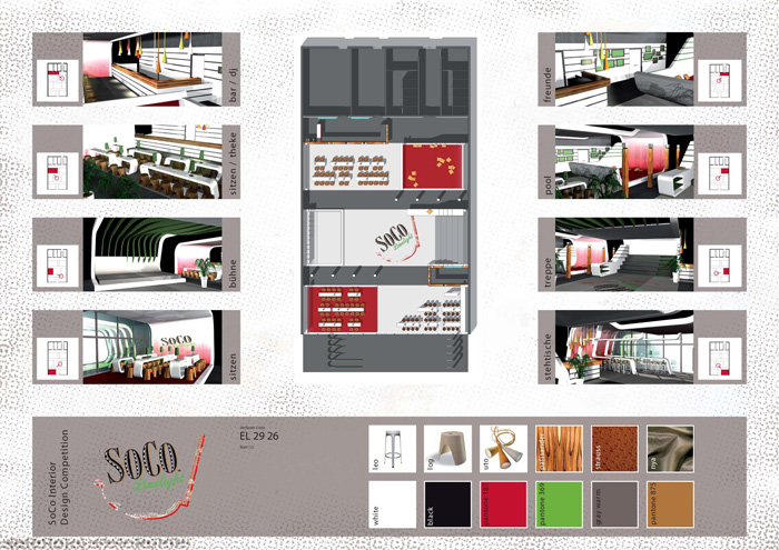
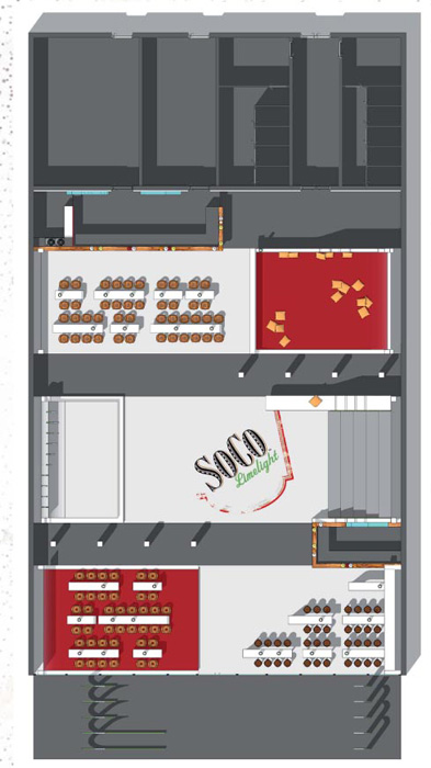
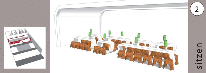
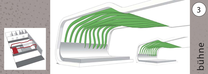
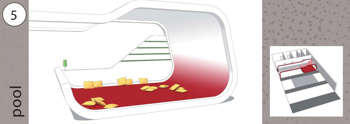
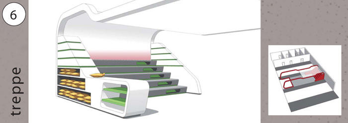
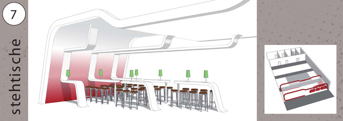
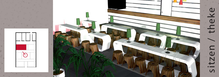
)our concept was basically "bring the street into the bar". we had a marketplace, where everybody can meet, streets to zone the room and also to provide the infrastructure (read here: beverages / bar), and different blocks (like buildings). blocks were seating on bar stools, seating on regular chair-height stools, a pool (seating in a carpeted area with cushions), a stage and lat but not least a set of steps. i think every city should have major stairs, that is where people sit, meet, hang out,...
the designing was done with SU, the final renderings my friend made with cinema. i'm showing you the two final sheets we submitted, plus a few details (straight SU-output).
oh yeah, we made second place

-
very beautiful design. the presentation is WOOOWW
-
Eeva,
Great design and a beautifull presentation.
-
Eeva,
Beautiful work and a great example of native SU work. Were your sheets done in Layout or Photoshop?
Scott
-
Awesome Eeva. I like the last images where you "highlighted" the overview as a locater. Great idea!
-
thank you all for your compliments, i feel like blushing
scott, the sheets were done in adobe illustrator. i would have prefered adobe indesign (as i'm used to it, and it links the pictures, you don't have to place and resize everytime the pictures changes), but as we divided the work and my friend put together the sheets, it was his choice.
i really enjoyed designing in SU (as always) and also like the native, clean look. and i also hope, i have shown my friend, that you CAN work with SU (he is the only one who keeps resisting, hope he reads this
) -
thank you james! yes, you are right, it is very modern and clean, and that was also the criticizm... we were supposed to reach young people between 18 and 25, but with this clean look we were more for the persons 25 - 40. oh well...
-
Veeeery nice eeva.
-
Congratulations. These are very nice. Would it be possible to see more details of the second poster, with the rendered images, if you're friend doesn't mind? I would like to have a better understanding of the lighting in your project.
-
thank you lewis. i'm pretty sure my friend does not mind me showing off his work
here you go:
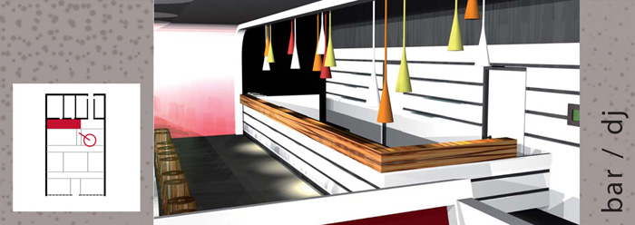
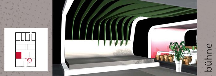
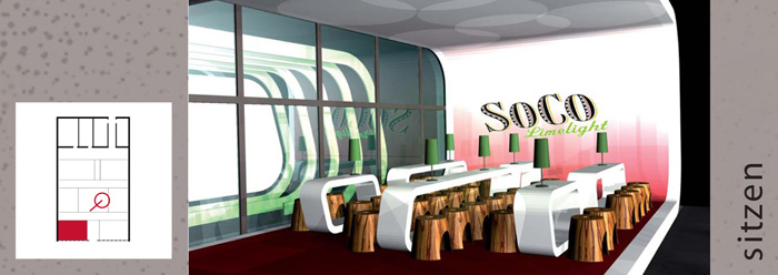
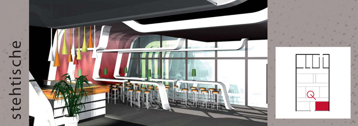
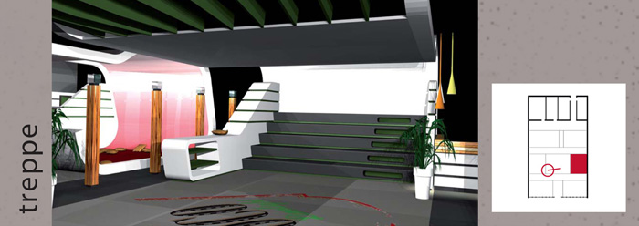
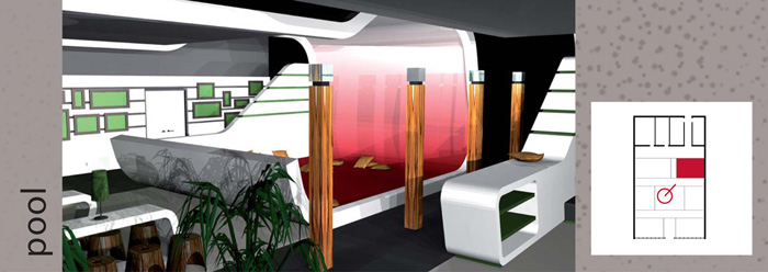
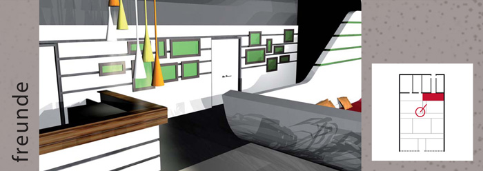
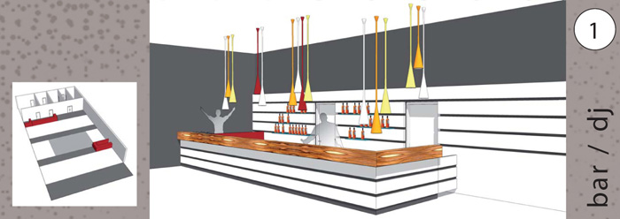
lighting is pretty simple: the wallcoverings are white fabric, behind that there is a red lamp, so you see on the inside the gradient.
on the tables we had generic table lamps.
above the bars we had these lamps by foscarini.
above the stage between the green "bars" there should be spots, but we did not want to show them.
also if there would have been some dark sport, then there would have been the possibility to hang them from the ceiling.due to the timelimit we did not emphasize too much on propper lighting, just lighting for the atmosphere of the room. besides the timelimit, we had other restraints too: we live 200 km apart and we both work full-time. we did this in four weeks, sitting at the same table just twice.
-
Thanks, Eeva. They really do look great.
-
Coen,
Don't dig that hole any bigger, 'Washed Out'
I think the word
might be 'subdued'?Eeva, just spotted this thread, well done to you and your team
Mike
Hello! It looks like you're interested in this conversation, but you don't have an account yet.
Getting fed up of having to scroll through the same posts each visit? When you register for an account, you'll always come back to exactly where you were before, and choose to be notified of new replies (either via email, or push notification). You'll also be able to save bookmarks and upvote posts to show your appreciation to other community members.
With your input, this post could be even better 💗
Register Login


Advertisement