Hi, and another valid use for SketchUp
-
Thought I should introduce myself, and as I am not actually a newbie to SketchUp, I thought I would post another way we use Sketchup to add strength to preliminary presentations.
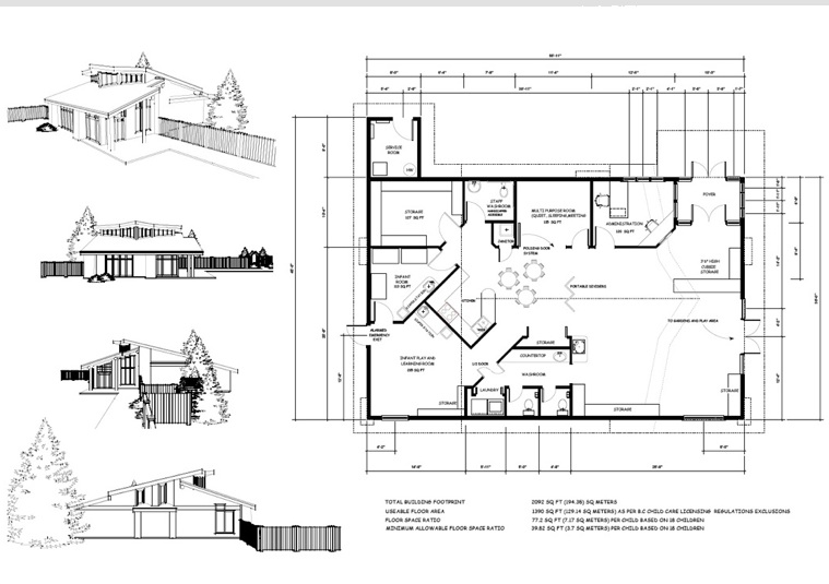
We have tended recently to use a lot more "sketched" versions of our models while working with clients in the early stages of conceptual project design. We found that if we presented full color, (even SketchUp only) 3d models it seemed that the clients assumed we were further along in the process than we actually were, and sometimes this would impede the dialogue that is so necessary at this stage of a project. So even though we could present a more complete visual we "dummy" it down a little.
The attached is the first preliminary floor plan concept for a small early childhood development centre on a first nation reserve. Various SketchUp scenes were imported into Vectorworks as image files to give the client a little more visual information.
I think that it shows one more of the strengths of this software.
Anyway, to complete my introduction, I am a designer working on Vancouver Island, Canada. I was lucky enough to have rubbed elbows with some of you at 3D Basecamp in Mountainview,and wanted to say thanks to all of you for your amazing contributions to this community, as well to the SketchUp folks all the way back to @Last for putting the fun back into design.

-
Dale,
Great to have You here.
Thanks for Your contribution and I hope to see more of it.Cheers,
Mateo -
That "dummy down" approach is so true!! Great images.
Todd
-
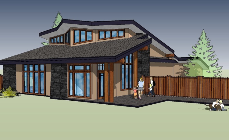
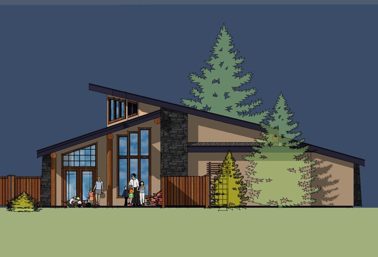
 Here is the original "Dummied Up" version the sketches were taken from.(SketchUp only)

-
Yeah, I thought the sketch format, and the presentation board overall, looked great too!
Most of my work (dang it!) is such. Some of it does get to the materials study stage, but seldom is a finished model requested (i.e. "paid for")...though my rendering studies have been helping me push toward the latter. (Maybe someday :`)
EDIT: These "dummied up" versions make for simple and sweet studies as well.
-
I really like that last image of the SketchUp elevation!
-
great glass technique in those later images!
-
@unknownuser said:
This is a very useful visual concept dale and good idea for preliminary presentations.
Thnx for that and welcome. I like ur color schemes too, nice. The glass kinda looks like the default glass material that comes with SketchUp.Thanks for the comments all. Your right, the glass is the standard SketchUp glass with the color edited. I had to be efficient with my use of time on this, as there is a difficult conundrum with First Nations. They have a very complex government bureaucracy for them to go through for funding, which always seems to get better response and results if there are good visuals accompanying the application, but there is absolutely no money available to them for conceptual work, and their budget, particularly for this group, is stretched to the limit, as there are many projects they require.
-
Dale.....
New guy here. To forum anyway. Images look very professional for sure. Care to talk about your work flow?
- Any 2D/3D CAD work before importing into SU?
- I think I saw you are MAC platform? Do you export/import from ArchiCAD?
- And at what point do you leave SU...... and where do you take it for 2D presentation?
I am outside Philadelphia, PA USA.
Hello! It looks like you're interested in this conversation, but you don't have an account yet.
Getting fed up of having to scroll through the same posts each visit? When you register for an account, you'll always come back to exactly where you were before, and choose to be notified of new replies (either via email, or push notification). You'll also be able to save bookmarks and upvote posts to show your appreciation to other community members.
With your input, this post could be even better 💗
Register LoginAdvertisement


