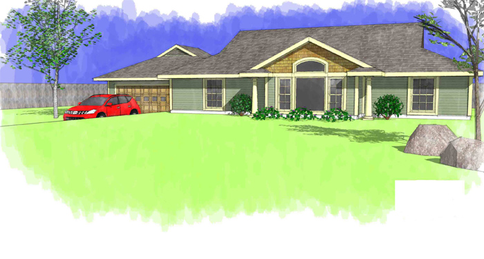
Latest Render
-
Hey All,
Haven't posted for a while. Thought I would post a quick one I did for a builder to update his 1970's brochure. Comments and crits welcome.RS2

-
Nice clean look, although id prefer a bit more detail for the grass, i think it oculd add a lot to the render.
-
Great job!
I actually like the flat grass as it focuses attention to the home, however I would use a darker-not-so-lime green.
-
Great rendering. You might try resizing the center plant (smaller) and maybe one of the others slightly larger, so they don't look like three clones.
-
I like the look of the scene.
Certainly agree with what has been said. Tone down the grass colour and scale the plants a little to take away the uniformity.
-
Hey thanks for the input. I appreciate your comments.
Ron
Hello! It looks like you're interested in this conversation, but you don't have an account yet.
Getting fed up of having to scroll through the same posts each visit? When you register for an account, you'll always come back to exactly where you were before, and choose to be notified of new replies (either via email, or push notification). You'll also be able to save bookmarks and upvote posts to show your appreciation to other community members.
With your input, this post could be even better 💗
Register LoginAdvertisement


