INTERIOR
-
@jsteacy said:
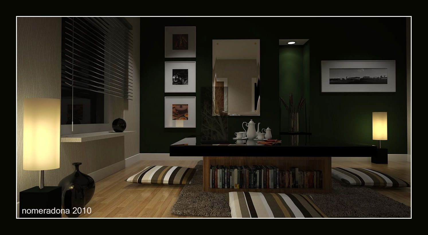
Great image, I really like the lamp shade material. Did you model the pillows in sketchup? I've only attempted pillows a couple of times in sketchup and have gotten ok results.
pillows were imported 3ds. -
Very nice render, it’s clear that you are completely master of this great engine (V-Ray).
But, since we're talking about an image that is close to perfection, i would like to expose some constructive criticism:
The window on the left, in my opinion should be brighter, like the one that sees in the mirror.
So even the black shiny sphere on the window sill, should have a much light and brighter reflection (being in front of the window).Finally (and this is perhaps the most important point), in my opinion there is something that does not return correctly with the lighting:
It seems that the main light source comes from above instead of directly from the windows and lamps.
Just look at the shadows under the cushions, under the picture frames and under the window sill.
They are all shades of light coming directly from above, as if the ceiling had a light source stronger than those visible in the scene (this becomes very obvious lightening the image with photoshop).
But if so, the higher parts of the walls should be brighter than that.
In addition, the table (taking the light from the window), should throw its shadow on the pillow to the right of the image. but this does not happen!Perhaps this depends on your own research in this picture to illuminate the scene with different light sources.
It may be that you used a fill light, but you forgot to eliminate shadows.Or maybe it's me that i did not understand much.

However this is just my opinion, and all in all i think that the image in question is really very impressive, although there are some points that i believe must be resolved, to obtain a realistic and proper lighting of the scene.
ivan
-
thanks ivan for you crits. much appreciated.
-
Here is another one, no BG and GI color.
[size=200:2m9epv1f]

-
@nomeradona said:
thanks ivan for you crits. much appreciated.
Thank you Nomer, i saw all your work on your blog and on deviantArt, and i have to congratulate with you again for your professionalism and your art.
This last image you posted, that night, i feel so much better. I would say perfect!
See you
Ivan -
nice to see your work again bud, good job.
-
thank you steeler. appreciate.
-
STUNNING WORK! Mate!
Wow everything is balanced well, I'd probably like to see the downlight in the recess throwing a bit more light just to drag the eye to the interest there.
BTW mate is the finish to the window shelf right? It looks to be the same as what I would imagine as paper on the walls!
Well done mate, makes me want to be in the room and soak it up! Exactly what you were trying to project I'm sure!
-
@richard said:
STUNNING WORK! Mate!
Wow everything is balanced well, I'd probably like to see the downlight in the recess throwing a bit more light just to drag the eye to the interest there.
BTW mate is the finish to the window shelf right? It looks to be the same as what I would imagine as paper on the walls!
Well done mate, makes me want to be in the room and soak it up! Exactly what you were trying to project I'm sure!
hi richard,
coming from a great maxwell rendere like is humbling. but im happy with your comment.

you are absolutley right in increasing that light. i actually gave that IES a bit more of multiplier to get the effect lighting on that niche to be highlighted but i end up overburned on the floor. im actually having a dilemna if it s the wall color or if it is the IES data. but my suspect would be the green color.
I wanted to achieved a wall paper effect on the wall. Matte finish.
-
Amazing work nomer.


So glad to see you posting, best wishes for a creative new year. -
@michaliszissiou said:
Amazing work nomer.


So glad to see you posting, best wishes for a creative new year.
thanks michalis. -
Beautiful render Nomer.

-
hi sid,
thanks man..
another one rerendering and redesigning


Hello! It looks like you're interested in this conversation, but you don't have an account yet.
Getting fed up of having to scroll through the same posts each visit? When you register for an account, you'll always come back to exactly where you were before, and choose to be notified of new replies (either via email, or push notification). You'll also be able to save bookmarks and upvote posts to show your appreciation to other community members.
With your input, this post could be even better 💗
Register LoginAdvertisement


