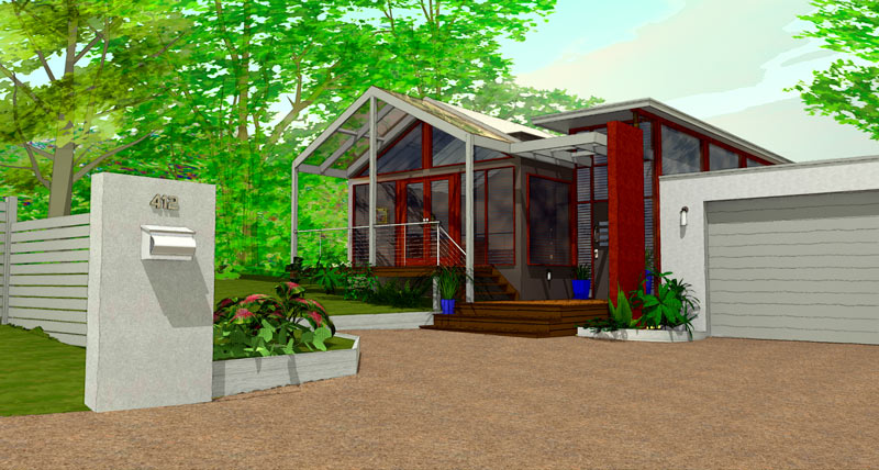
Npr render with twilight a la Majid and Tom
-
Hey Baz, wish I'd jumped in earlier 'cause you've been led way away from an image I found quite delightful...hope you still have that setup and scene as I'm commenting about that first one :`)
First off, homey is a bit different than homely in my mind...and homey is a good word for the impression I got from the first image(s): a private sanctuary separated from the outside and nestled under the protection of a canopy of trees...a family's safe place. Now if the house was intended to be the focus of the image, rather than this feeling of home, I would agree with the changing of the scene: moving in, losing some of the barrier, down playing the trees...in fact, I'd probably go much further than you did, and so, nevermind all that follows. But if not, I'd go another way :`)
Okay, things I really! like:
The different paths to be followed...the road continues on unimpeded (a shallower angle without as much break at the grass could amplify this rapid pass by) (also some rutting or other discoloration like a shadow could enhance that corner of the image without causing distraction); into the drive slowing to a halt (the simplicity of the image here forces the viewer to do this mentally...I think, and is powerful) (again, some shadows cast would distract from the drive material tiling...could be enough?)
The private spaces hinted but not shown...the corner around the fence on the right is a great anchor here (but in my opinion needs something more, another splash of color through the slats...maybe a red trash can?) but outside the corner is pretty "dead" (you can't show the road litter that would always be trapped there in reality, but something unimportant there might help?); the little vista into the yard and grove beyond is for me the best part of the composition: it draws me in, it makes me look thru the fence (and so enlivens it's simplicity), it make me feel the volume of the house...cool! And the white structure of the covered porch jutting into it is kinda sexy...:`)
Don't lose the bike! Love the bike! It leads me across the expanse of drive, it makes me consider the steps, the entry, then the house...it slows me, warms me, brightens me to what I will encounter inside. Don't lose the bike! (In my opinion :`) (If appropriate, I might even try adding another...somewhere around the right side of the drive, peeking out from behind the fence?)
I think the potted plants reinforce the stages of entering the house, and show off the uncovered porch pretty much hidden in the shadows (I might consider changing up the repetition...maybe using blue and white chinese pots in the shadows?)
The Twilight render (don't you love this program!) and the post-pro work is lush and juicy, just right IMO! (I think using the grass edge Fletch recently provided on the TwilightRender forum would help the edge of yours, and maybe increasing the scale of your grass material would defeat some of the tiling? And again here, a shadow may do a lot to help?) (I've been playing with rendering pavement a bit wet to get away with "vast" areas of it in the foreground with some success; also been doing a second render with the scale of material increased a bunch, then "combining" the two in PSP with the eraser tool?)
The dark canopy created by the trees, and especially the volume it creates for the lawn beyond, is quite special...I've never created such a realistic volume with my trees: Wonderful! and thank you for the study aid! (I'm thinking it's only the saturation and maybe even more the combination of colors that distracts...but, for me at least, not by much: at all, though I would try to adjust it.) The white of the sky doesn't work for me, I must say (and maybe some blue there would cool down that searing yellow tree at the edge of it?)
A couple of things about my trees:
My early trees were indeed quite "hot" (saturated)...dialing down the saturation in SU helps them alot. To add further control I will sometimes export the png from SU (right click on the leaf-bunch png) then change it to "greyscale" in PSP and rename. Importing it back into the tree is usually much easier if you copy one of the trees, explode, then erase it later. This action will give you a leaf-bunch component in the SU component browser that is vertical and un-rotated. You can then replace the old image with the new inside an instance of this component by simply selecting the lower-left corner of the old (I usually explode the old and group the face and 4 edges so I have corners to snap to) as you place the import, holding the button down and draging the new to perfect scale as it snaps to either the right or top edge of the old. Then erase the old and all your trees are updated. Now you can change hues and tones just like my newer trees.
Also you'll notice the reflection of some of the trees in the windows are looking at the edges of the leaf-bunch pngs, since the trees are facing the camera location rather than the "reflection incidence"...looks pretty bad most times, feels pretty bad all the time once you notice and know what it is. Now that I'm using Twilight too, I've been figuring the angles, then rotating the off-image trees (after exploding them not to face the camera) to match for good reflections...don't know what else to do since this is the nature of the face-me beast.
Anyway, I like it! And I want to see more rather than different!
-
I liked the bike. For me those little "lived in" details bring a render to life. Sort of the whole entourage idea. If you were making this for a client with kids, they would probably dig it, I know I would... damn yard apes leave their bikes all over the front lawn.
-
Hi Tom,I've just logged on to post v5, so I hav'nt read your post properly yet.
But my first thoughts about your views versus Richards are about what a render is for.
Usually I guess this is largely up to the client, who of course is always right
In this case it's entirely subjective as well as making me think hard about process, intention et al.
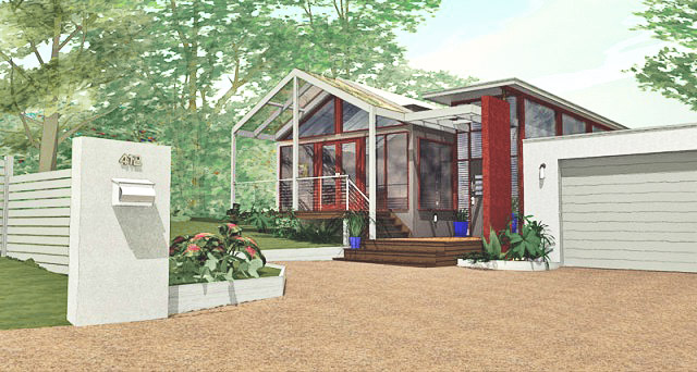
However, here's my latest attempt following Dicks' advice.
For some reason the trees gain colour in the conversion from psd to jpg, something to do with how P/shop assigns colour profiles i think, back to the manual.justin, the whole entourage thing is open to debate from what I've seen, I've read many comments on this forum for and against.
Baz
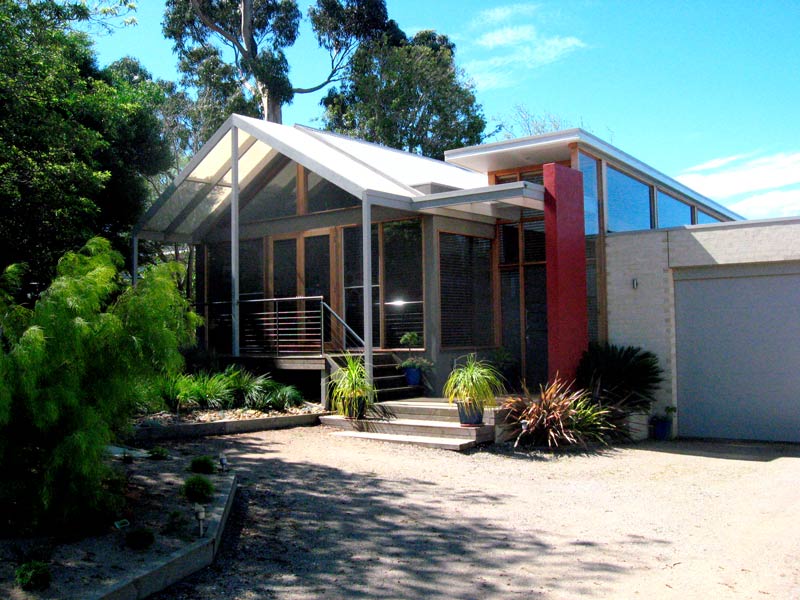
Ps: It might be useful to show you the reference for the render - a house in my neighborhood that caught my eye.
Pps: Now that is interesting, the photo is uncropped straight from the camera, this is the first time I've put it next to the render, and the view is almost exactly the same in both.

-
Baz I saw the gummies then noticed your in Aust!!! Didn't realise!
Quick play in PS! Mate I'd try just combining by weight two SU only image exports at two differing sun angles and see what the effect might be! You can even export the first then pull back into SU as a watermark and adjust blending! If you do the later you will when playing with the second sun angle suddenly notice the almost rendered feel jump out when you hit the right shadow cast!

-
Richard, that looks good!
Is what you are proposing a new technique?
I've not come across it before.
I will give it a go.
baz -
@baz said:
Richard, that looks good!
Is what you are proposing a new technique?
I've not come across it before.
I will give it a go.
bazWell yes and no baz!
Similar to the technique I worked out in this thread! Just taking out all the PS work!
http://forums.sketchucation.com/viewtopic.php?f=81&t=16807&hilit=+rendering+this+is+cool
-
@richard said:
Baz I saw the gummies then noticed your in Aust!!! Didn't realise!
Actually the trees are from 'Toms tree bundle', I changed the trunk colour to 'ghost gum', beige really.
I can't play here for a while, the real world has caught up with me, work wise.
I will check out the 'new' technique and post again in 3/4 days.
Meanwhile, thanks all for your interest and help.
Baz
ps: What do you think of Toms comments? I'm not stirring, just curious. -
@baz said:
@richard said:
Baz I saw the gummies then noticed your in Aust!!! Didn't realise!
Actually the trees are from 'Toms tree bundle', I changed the trunk colour to 'ghost gum', beige really.
I can't play here for a while, the real world has caught up with me, work wise.
I will check out the 'new' technique and post again in 3/4 days.
Meanwhile, thanks all for your interest and help.
Baz
ps: What do you think of Toms comments? I'm not stirring, just curious.Mate I was meaning the gummies in the photo reference!!!
Mate Tom has been quite gracious in giving you a lot of respectful informations!! It's hard to suggest it's right or wrong! I certainly agree with his comments about getting some tree shadows onto the driveway though at the same for this type of render I'm still not sure!
I would agree with Tom's comments about the trees not giving volume as cutouts tend to be lacking in that regard. If I use cutouts in a render I tend to paint them to a sandboxed grid so they avoid that flatness, or push planes back and forth! I'm not sure how Toms trees are constructed so not sure what the best method would be!
I'm not one to clutter scenes so that you loose the actual building, for example the one thing that caught my eye was the bike and pots - could be due to the angle of the shadow hiding much of the dwellings frontage! One thing I'd never do though is leave stuff lying around I'm not sure why one wants to take away from the design - your job doing a render is to show the dwelling not the entourage!
The other thing I feel and it sounds a bit adverse to where we are (the SU forums) but mate this style for me is verging on common SU! SU/PS has so many cool ways to create some nice styles and they just don't seem to be utilised, the same gets regurgitated over and over and is all so similar to the old dennis technique of years gone and it's getting old!
For me your scene is already well over baked, adding more clutter, more effect, more shadow - all when your not utilising the option to create realism is all just tending to obscure the actual purpose!
KISS - Keep It Simple Stupid is a fairly common term in aust and one worth observing generally I think!
-
BTW mate! Not meaning at all to suggest that I don't understand why you are wanting to adopt new techniques but simply suggesting to look toward new styles!
-
gotcha.. food for thought.
baz -
Nice renders, but a bit too colorish in my sight. and were are the edge lines (in my tip, they are present
 )
)
Hello! It looks like you're interested in this conversation, but you don't have an account yet.
Getting fed up of having to scroll through the same posts each visit? When you register for an account, you'll always come back to exactly where you were before, and choose to be notified of new replies (either via email, or push notification). You'll also be able to save bookmarks and upvote posts to show your appreciation to other community members.
With your input, this post could be even better 💗
Register LoginAdvertisement


