sketchucation logo sketchucation
    • Login
    Oops, your profile's looking a bit empty! To help us tailor your experience, please fill in key details like your SketchUp version, skill level, operating system, and more. Update and save your info on your profile page today!
    Mac User? | Join the Rayscaper Beta for Mac Learn More

    Watercolor and line drawing

    Scheduled Pinned Locked Moved Gallery
    24 Posts 9 Posters 3.2k Views 9 Watching
    Loading More Posts
    • Oldest to Newest
    • Newest to Oldest
    • Most Votes
    Reply
    • Reply as topic
    Log in to reply
    This topic has been deleted. Only users with topic management privileges can see it.
    • N
      nomeradona
      last edited by

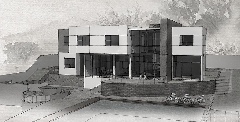
      playing with styles, render and compositing in Photoshop.

      http://farm3.static.flickr.com/2564/4085649238_2f5e0190ab_b.jpg

      http://farm3.static.flickr.com/2741/4084892467_26966c7231_b.jpg

      http://farm3.static.flickr.com/2728/4085649520_82431bb71f_b.jpg

      visit my blog: http://www.nomeradona.blogspot.com

      1 Reply Last reply
      Reply Quote 0
      • dermotcollD
        dermotcoll
        last edited by

        Beautiful work - very similar output to Piranesi - I love that style.

        When you burn your arse - you gotta sit on the blisters!!

        1 Reply Last reply
        Reply Quote 0
        • T
          tomsdesk
          last edited by

          Lovely!

          http://www.tomsdesk.moonfruit.com/
          2.5D Trees & Shrubs!

          1 Reply Last reply
          Reply Quote 0
          • brodieB
            brodie
            last edited by

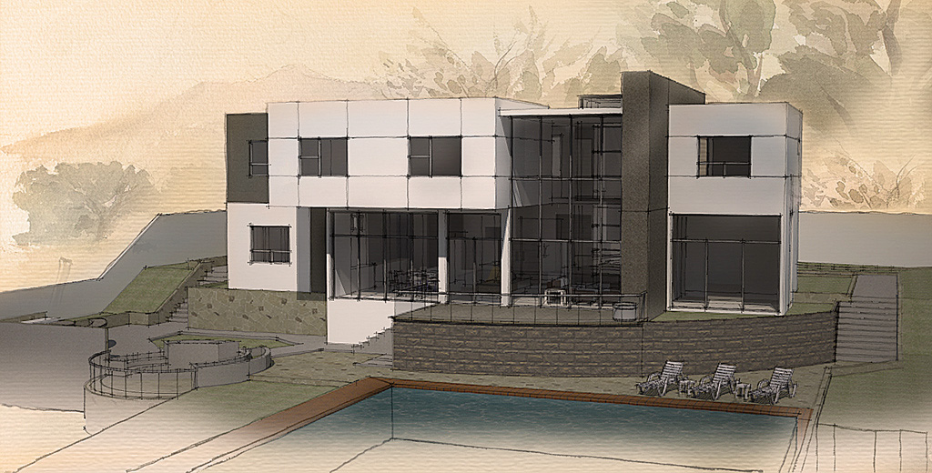
            very cool, really like the last two. I think my favorite would be somewhere in between. the background in the second may be to saturated for my taste but gives a lot of warmth. the 3rd looks very neat but probably too cold. Somewhere in the middle would be a nice warm background that doesn't hog the attention.

            Great style! Can you talk a bit about your process?

            -Brodie

            steelblue http://www.steelbluellc.com

            1 Reply Last reply
            Reply Quote 0
            • brodieB
              brodie
              last edited by

              Hope you don't mind me taking a crack at it, being inspired by your images and all. I blended the 2nd and 3rd backgrounds and added a warm photo filter to blend the building w/ the feel of the background.

              -brodie

              c.jpg

              steelblue http://www.steelbluellc.com

              1 Reply Last reply
              Reply Quote 0
              • RichardR
                Richard
                last edited by

                Mate the me the last image is just about PERFECT!!!!

                BUILTBRAND.COM.AU

                1 Reply Last reply
                Reply Quote 0
                • N
                  nomeradona
                  last edited by

                  @dermotcoll said:

                  Beautiful work - very similar output to Piranesi - I love that style.

                  i heard piranesi many times but i have not tried it..i think i will look at it.

                  visit my blog: http://www.nomeradona.blogspot.com

                  1 Reply Last reply
                  Reply Quote 0
                  • N
                    nomeradona
                    last edited by

                    @unknownuser said:

                    @dermotcoll said:

                    Beautiful work - very similar output to Piranesi - I love that style.

                    Yes I agree they do look slightly Piranesi. I am really liking these Nomer.
                    Great work πŸ‘

                    thanks james.. as promise i will do the tut.

                    visit my blog: http://www.nomeradona.blogspot.com

                    1 Reply Last reply
                    Reply Quote 0
                    • N
                      nomeradona
                      last edited by

                      @tomsdesk said:

                      Lovely!

                      thanks tom.. you like it.

                      visit my blog: http://www.nomeradona.blogspot.com

                      1 Reply Last reply
                      Reply Quote 0
                      • N
                        nomeradona
                        last edited by

                        @unknownuser said:

                        very cool, really like the last two. I think my favorite would be somewhere in between. the background in the second may be to saturated for my taste but gives a lot of warmth. the 3rd looks very neat but probably too cold. Somewhere in the middle would be a nice warm background that doesn't hog the attention.

                        Great style! Can you talk a bit about your process?

                        -Brodie

                        thanks brodie for doing that. still new with this kind of technique but i think i will explore more.

                        visit my blog: http://www.nomeradona.blogspot.com

                        1 Reply Last reply
                        Reply Quote 0
                        • urgenU
                          urgen
                          last edited by

                          ...nice! β˜€ thank you! πŸ‘

                          --pupil forever...------

                          1 Reply Last reply
                          Reply Quote 0
                          • N
                            nomeradona
                            last edited by

                            @richard said:

                            Mate the me the last image is just about PERFECT!!!!

                            hi rich.. thanks for your comment.

                            visit my blog: http://www.nomeradona.blogspot.com

                            1 Reply Last reply
                            Reply Quote 0
                            • N
                              nomeradona
                              last edited by

                              @urgen said:

                              ...nice! β˜€ thank you! πŸ‘

                              thank you also urgen..

                              visit my blog: http://www.nomeradona.blogspot.com

                              1 Reply Last reply
                              Reply Quote 0
                              • I
                                imabzeous
                                last edited by

                                can u share the style plzzzzz

                                1 Reply Last reply
                                Reply Quote 0
                                • N
                                  nomeradona
                                  last edited by

                                  i used two styles which indeed you can find them as winners in the style building competition.

                                  visit my blog: http://www.nomeradona.blogspot.com

                                  1 Reply Last reply
                                  Reply Quote 0
                                  • I
                                    imabzeous
                                    last edited by

                                    @nome

                                    i want that first one style da blue one can u share it plz...

                                    1 Reply Last reply
                                    Reply Quote 0
                                    • T
                                      toxicvoxel
                                      last edited by

                                      Nice job, but I want to make some recommendations:

                                      If you turn the image into grey-scale and squint, you can see that it lacks a little bit in mid-tones. If you create a little contrast in the range of values it would possibly make the image a little stronger.
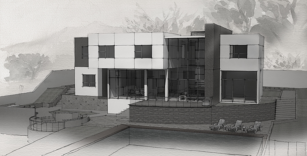
                                      Current
                                      Adjusted (-not perfect but you get the idea)

                                      One other thing you could consider trying is to change the deeper values in your image to blues (cool shadows) or browns (warm shadows). Colours in traditional media are normally mixed to avoid greys and blacks and this may move your image one step closer to a true watercolour style.

                                      Finally let the 'wash' gradient run through to the edge of the image. At the moment it looks like a soft shadow in the foreground (cast by the building) which conflicts with the direction of shadows on the columns.

                                      1 Reply Last reply
                                      Reply Quote 0
                                      • N
                                        nomeradona
                                        last edited by

                                        thanks toxicvoxel for your insight. appreciate it.
                                        @imabzeous.. read my pm..

                                        visit my blog: http://www.nomeradona.blogspot.com

                                        1 Reply Last reply
                                        Reply Quote 0
                                        • S
                                          stann_ph
                                          last edited by

                                          bossing lupit ng gawa mo ah... idol

                                          1 Reply Last reply
                                          Reply Quote 0
                                          • N
                                            nomeradona
                                            last edited by

                                            @stann_ph said:

                                            bossing lupit ng gawa mo ah... idol
                                            thanks mark, but can you please write in english,...

                                            visit my blog: http://www.nomeradona.blogspot.com

                                            1 Reply Last reply
                                            Reply Quote 0

                                            Hello! It looks like you're interested in this conversation, but you don't have an account yet.

                                            Getting fed up of having to scroll through the same posts each visit? When you register for an account, you'll always come back to exactly where you were before, and choose to be notified of new replies (either via email, or push notification). You'll also be able to save bookmarks and upvote posts to show your appreciation to other community members.

                                            With your input, this post could be even better πŸ’—

                                            Register Login
                                            • 1
                                            • 2
                                            • 2 / 2
                                            • First post
                                              Last post
                                            Buy SketchPlus
                                            Buy SUbD
                                            Buy WrapR
                                            Buy eBook
                                            Buy Modelur
                                            Buy Vertex Tools
                                            Buy SketchCuisine
                                            Buy FormFonts

                                            Advertisement