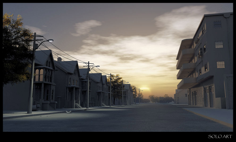
Some more Vue renders
-
I always enjoy seeing your renders because, unlike the vast majority of professional-class renders, yours have an element of art to them instead of making ultimate photo-realism the only goal. So keep them coming!
Trying to find anything less than perfect in these two renders is a bit of a task, but it might be possible to improve a few things: the corbels could be roughed up a bit (they look like smooth plaster against all the concrete); the palm tree is gratuitous (a single, off-centre tree in that environment is extremely unlikely and is not necessary to create an "exotic" feel; the entire environment already does that); and the texture you used for the pavers in the foreground looks a little low-res and might benefit from some bump (or more likely: detail has been lost in resizing the image for posting here...).
-
hats off to you, Solo... I have literally a thousand hours of experience in Vue (half of those waiting for it to re-start after a crash... probably a compatibility error with my vid card but was never nailed down)... I really like the lighting in the first image.
-
What I like: Beautiful renders as always. The street scene especially is fantastic. Here we have a battle, two armies. Simple and great.
what I don't like: these street lights, this very well known model. You need something more detailed here pete. -
you are taming really this VUE engine Pete... I have seen a lot of your beautiful renders.. and i must say that these are one of your best.. the contrast, the play of lights, the unity of the composition. just one thing, i think the grooves of those tiles in the first two images are a bit big. overall bravo amigo...
-
can,t awit for the tutorial from the master....

-
Listen pete. There isn't any color profile assigned in your images. So they look somehow grey in my monitor, until I changed system color profile to sRGB. So everybody, when posting, please assign a common color profile like sRGB. (convert to profile in photoshop or gimp). If you don't and if using XP, then vista or OSX users should turn their color management to sRGB.
Now in (sRGB), these renders look 30% better. I like your work 15% more and Vue 60% more. lol
BTW I use an expensive 24 monitor, well calibrated, (in DTP business for years). -
@michaliszissiou said:
Listen pete. There isn't any color profile assigned in your images. So they look somehow grey in my monitor, until I changed system color profile to sRGB. So everybody, when posting, please assign a common color profile like sRGB. (convert to profile in photoshop or gimp). If you don't and if using XP, then vista or OSX users should turn their color management to sRGB.
Now in (sRGB), these renders look 30% better. I like your work 15% more and Vue 60% more. lol
BTW I use an expensive 24 monitor, well calibrated, (in DTP business for years).Wow, just followed your advice,(imac 24") and what a difference in Solo's renderings. Gives them a great deal more realistic depth.
Perhaps you could start a thread on monitor calibration. for Mac users the path to change to RGB is; apple menu/system preferences/displays/color, then choose your RGB Profile -
Strange, I just checked these images on my Imac and on a Mac-book and the colors seem fine, are any of my other renders displaying wrong too?
I am working on a 64bit Vista Ultimate machine and my monitors are all LCD's calibrated with a screen spyder2, so maybe I'm missing something or I did something in post edit to screw with the colors, I recently sent some images to the printers for 6x4 ft site signage and they never said anything (but then again they are probably used to these issues and correct them automatically)
I would hate to be posting anything if they look wrong, good find Michalis and thanks for the heads up even if I cannot figure this out on my side.
-
michalis you are right. im on imac 24" and i was using standard imac colour profile. I changed to sRGB and renders appeared to have more depth. It seems there is more blue and contrast.
My renders look better too in this colour profile, although like i said more blue and cold.
So what is the best profile to use? Standard colour profile seems to print off correctly.......what do u suggest?
-
Well because you can witness the change when you actually change the settings, if you have the renderings up on the screen, you can see the change is quite pronounced. I thought maybe I could capture the difference on a screenshot, but neither a png or a jpeg does the difference any justice. olishea has described it quite well it has a blueness to it which is not overpowering, but give nice depth details.
-
OK I can write a small tutorial but don' mesh anything yet. This is not a mac problem, please read about color profiles first.
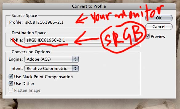
The only thing you have to do is: open image in photoshop, edit>convert to profile>destinatition should be srgb see photo.
Here source space is sRGB but could be monitor X profile or simple RGB or anything. Leave Black point and dither checked.

-
yeah the warmth in my renders is lost when I view in RGB. Even this website appears to have more blue in the text and banners when viewed in RGB as opposed to the imac colour profile (looks more grey).
So Michalis, If I assign an image to be sRGB will my imac view it in sRGB or the imac colour profile (if the imac colour profile is assigned)? and which display settings do you use day-to-day?
-
For windows XP be sure to have nothing in color management window, if you find one just delete it.
For vista and OSX just have the best monitor profile, there are many calibration apps, ((OSX has its own, but its best to use a monitor profile that came with your mac, (24'' imac, or 24'' led display). For other fine monitors just use calibrator))
Older macs as my 2.33 dualcore 17'' mac book pro, work better with sRGB.Here comes photoshop. First go to edit>color settings and on working space assign your monitor profile, tell photoshop not to color manage anything on import. Something very similar works with gimp.
When you PP an image, just convert it to a common color profile like sRGB -please dont assign your monitor profile because possibly you are the only one on the planet who has it.
If you don't want to do all these, just use view>proof setup and have a look how typical windows or macs or your monitor profile looks like.
Sorry for my english, I hope all this above helps.Remind you this too. Lots of users use windows XP. Just a few can see colors correctly. Colors on my PC look the same as on my MACs. Give a try and don't be suspicious with mac users.
Again: Vista and OSX have a fine color management, XP or some Linux have not.*here's a test. Download one of solo's fine renders, open in photoshop, assign sRGB profile, save, quite. Now open in preview and compare this with explorers's or firefox or safari's site view.
No I have a better idea, see solo's render with sRGB assigned. Compare it with the attachments preview (SCF machine discards color profiles when it creates previews)
-
I think I'm spoiling pete's fine post but these are great renders (sensitive) and a fine opportunity for this.
-
I don't get it. On my Vista laptop, these images all look fine.
No need to change any color space or anything.
Must be a Mac only thing..?Now if Solo would have saved the images as CMYK I would totally understand it would look off.
But they are RGB.....and pretty nice ones I think
Hello! It looks like you're interested in this conversation, but you don't have an account yet.
Getting fed up of having to scroll through the same posts each visit? When you register for an account, you'll always come back to exactly where you were before, and choose to be notified of new replies (either via email, or push notification). You'll also be able to save bookmarks and upvote posts to show your appreciation to other community members.
With your input, this post could be even better 💗
Register LoginAdvertisement


